Over half a decade now, we have been starting our mornings checking our mobile phones. Also, during the day, we might be either working on the desktop screens moreover or checking our mobile phones.
There’s no such thing unavailable to find if you have a mobile phone and an active internet connection.
Stats report that the proportion of mobile internet usage in 2018 can be seen increasing by 79% which is a considerable leap considered to that of in 2016 which was 68%.
Moreover, the above numbers don’t seem to be ceasing. Thus, it becomes necessary for businesses as well to have their presence on mobile platforms as well.
Many businesses stand a store on these digital platforms only, but some still don’t find a way to reach onto these platforms.
Whether you have newly started or you have a business running for generations, it is mandatory for you to have created its online presence.
If you are clueless about where to start, you can find a website design development service to develop and design a responsive website for your business.
Further, relying on the hired responsive website design company can be enough; however, you should also know the basics about website designing.
Here, I present a small guide listing the basics to help you have the best and creative Website designed for your business.
1. Design a responsive website
You might be thinking what a Responsive Website mean. Well, to clarify your doubts I will cut it to the chase.
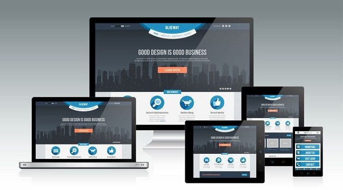
By definition, a Responsive Web Design means the website design that allows the web pages to perform efficiently on any device the user accesses the website.
The scenario nowadays makes it so obvious to understand how significant it is for a business to have an online presence on all possible digital platforms.
A Responsive Website moulds itself according to the platform it is being visited on and presents all the content and information to the visitor as it is available on the desktop website.
It allows the information to reach to all types of users with an efficient user interface and better user experience.
Also, SEO count on more on a responsive website design. Even the search giant Google prefers to optimize the mobile responsive websites more.
However, it is not an amateur’s game to develop an efficient website. You need to hire a Responsive Website Design Company or a professional website creator who is skilled with professional website templates.
If this is something hindering your way to get the website, slide it aside and get on the track to develop it.
2. Make the information quickly accessible
Not everyone is okay spending half an hour on surfing and look for something they want.
Be it any case; you should make the information easily accessible on your mobile website for every visitor.
Think as a mobile user, which information would you like to get from the website. Try adjusting that information in a quickly accessible way.
Make specific buttons or set the options in the menu to reach a particular piece quickly.
Add an FAQ section in the menu where you answer to all the questions which a visitor may have on mind while visiting your website.
Keep the answers relatable to both the mobile users as well the desktop users.
It might not look elegant with the graphic design websites to have too much content on the homepage, so adjust it smartly in the sections those are easy to find and navigate.
3. Viewport meta tag
To the readers who are not much techie, Viewport refers to the screen area on which the website will be displaying.
The screens vary from device to device; a mobile phone has a different screen size than that of a desktop screen.
Your website should be able to adjust the navigation and view as per the screen size of the device.
This tag commands the browser to adjust the width and the size of the webpage according to the screen of the device of the visitor.
Also, it is quite easy for any website design development service to add this tag in the website’s HTML code.
4. Make the UI and UX efficient enough
A desktop website provides different experience and interface to the user as compared to that of a mobile site.
It is compulsory for your business to retain the best UI and UX for the user on your website regardless of the platform.
Here are some important aspects relating to the UI and UX to always remember when opting for professional website design –
- Site Images – Everyone would like to make their website look the most beautiful and add high-quality images on his or her website.However, such images can make the site load slower on any platform.Consider compressing the graphics and images to ensure that your website speed stays unimpacted maintaining the beauty of it.
- Fonts – Fonts play an essential role in website design.Make sure the font size is adequate and readable on all the platforms.Try to stick to the standard fonts, not putting the user in a position to download the font and making him rush out of your website.
- Buttons – Whether you choose an eCommerce website design or a general informative one, you must add the buttons directing users to perform specific actions.Make them large enough to be visible and to tap on them.It is very different using buttons on a desktop and a mobile website. So design the buttons wisely suiting to the variety of platforms.
- Auto-correction – When you ask a user to fill up a form on your website, Auto-correction being on will irritate the user.Instruct your hired website design company to keep this feature off functioning to make it convenient for users to fill up the forms and hence, enhancing the user experience.
5. Experience it as a user yourself
Well, this is mentioned in the later part but is one of the critical aspects to remember while considering for an affordable website design.
Be it affordable for your business, but should be profitable at the same time.
You are supposed to check your website’s credibility and profitability yourself as you do in other aspects of your business.
Whether you are a beginner and have chosen the best website builder for small business, you need to check the functioning yourself as a user.
Check if your website is compatible enough on the desktop, the tablet and the mobile. Test them but think of yourself as an end user and not the business owner.
Notice all the minor details that a user would like or dislike on your website. Inform your web design company to work on any amendments necessary to the templates to assure better usability of the website.
Make it a regular activity for yourself to check your business website frequently and keep on the check with the best web development company for the maintenance.
Enclosing the final word
You might have understood all the tips but still wondering about how to hire the best website design company for your business.
You can search for the top 10 website design companies and check the web designing company sites to review their work.
Further, just getting the best does not end. You need to check on your budget as well.
Author’s Bio:
Manan Ghadawala, the founder of 21Twelve Interactive – one of the top Web design and Development Company in India and the USA, himself, is a seasoned Web Developer along with the extraordinary leadership skills which he applies to every project. He is a fantastic leader who stands as a backbone to his team and the company to achieve the desired success.

