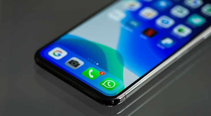
Use of mobile phones is continuously increasing. With the increasing demand, the need for mobile apps is growing as well. Mobile apps should be both useful and intuitive. An app should have a user-friendly design. How many times have you downloaded an app and got disappointed by its usability? Lost count, right?
The usability of a mobile app depends on some principles. These principles enhance user experience and lead the way to success for your app.
We will be discussing some of these mobile app UX principles here:
1. Decluttering
Clutter is one of the worst enemies of good design. An app shouldn’t overload users with too much information.
Clutter is terrible on the desktop, but it’s far worse on mobile. Anything that is not necessary should be cut off. Using too many buttons, images and texts make the app look complicated.
To avoid cluttering:
- Keep the design simple with minimum elements on the interface.
- Keep content minimum. Show only what the user needs to know.
- Use one primary action per screen. Every screen should focus on only one real action that has value for the user. This makes it easy for the users to understand how the app works.
2. Easy navigation
Users should be able to navigate an app with ease. It is a top priority. You may add a bunch of cool and compelling features. But they won’t matter if the users can’t find them. If it takes too much time to discover how to use your app, there is a chance you are going to lose users. Users should be able to explore the app intuitively and complete all primary tasks without asking for an explanation.
The followings steps may be followed to make the navigation simpler:
- Use standard navigation patterns. Such as the tab bar for iOS and the navigation drawer for android.
- Use correct visual metaphors so that the navigation doesn’t need any explanation and leads the way to the right destination.
- Navigation should be kept consistent throughout the app.
- The user should know the location he/she is in rather than getting lost.
- Create a “back” button that works properly in each and every screen.
3. Minimize User Input
Typing on a mobile screen isn’t one of the most comfortable things to do. It is slow and error-prone. If you build a mobile app that requires too many inputs from the users to operate, they will find it irksome. So, it is recommended to minimise the typing from the users. Here are some ways to do so:
- Forms should be kept short. Only relevant and necessary information should be asked from the users.
- Use smart features like autocomplete. Filling out problematic fields like addresses can be done by using geo-location and personalised data.
- Dynamically validate field values. It is frustrating to go back and correct mistakes after submitting data. It is better to check filled values immediately after entry so that they may be corrected right way.
- Customize the keyboard according to the type of query. For example, displaying a numeric keyboard while asking for a phone number is much more convenient.
4. Easily Identifiable Interface Elements
To ensure a great user experience, clear visibility of interface elements is a must. Concentrate on the colour and contrast for that. Use a consistent colour palette.
Some useful tips:
- Small text should have a contrast ratio of at least 4:5:1 against the background.
- Large text should have a contrast ratio of at least 3:1 against the background.
- For icons and other critical elements use a contrast ratio that is easy on the eyes.
5. Tap Targets and Hand Position
Tap targets need to be of convenient size. Generally, bigger ones are easy to hit than the smaller ones, and they also reduce the possibility of tapping the wrong one instead.
Tap targets of 7-10mm can be accurately hit with a finger. The edges of the target should be clearly visible.
Hand position is a fact you cannot ignore. Usually, people rely on their thumb to do things. It is important to place menu, frequently used controls and common actions in areas where they are comfortably reached and stretching is not needed. On the other hand, negative buttons like “delete” should be placed in hard to reach areas so that they don’t get pressed accidentally.
Conclusion
Mobile app UX design is actually a continuous process. The above ones are some important tips to get started with. They will provide a foundation but refinements must be made based on your app performance and user experience.


