Minimalism has made a really strong comeback in the design trends of today and it’s most likely here to stay. Designing a website based on the minimalistic aesthetic doesn’t mean you have to compromise on the site’s vital elements and functions.
In this article, we are going to show you how and why web design has such a huge impact on customer experience and how minimalism can maximize your site’s potential.
Focus on your message, avoid clutter
With minimalism, you try as much as you can to eliminate all unnecessary elements. To do that successfully, you should have a clear grasp on what message you want to get across before you could decide what are the must-haves on your site.
So when customers see your site, they don’t have to go through clutter before they understand what you’re trying to say. Additionally, having a highlighted message can translate into better conversion for your site because too much clutter can deter your customers from your call-to-action.
Express clearly what your business stands for
Getting rid of clutter gives you more space to make more elements stand out such as your USP (Unique Sales Proposition). In addition to an impressive USP, your user interface can also aid in expressing what your business stands for. You want a clear and catchy USP paired with appropriate visual aids to emphasize its impact.
A common happening amongst websites with a good USP is their common use of a subtle photo along with a clean design. The points discussed below could also guide you in how to set up your site so that the USP remains the highlight.
Use negative space to highlight page contents
The whitespace, also referred to as negative space, is also used in various art forms such as paintings, aside from its use in web design. In painting, the negative space gives off a sense of calm and allows a person’s mind to wander freely. It’s highly similar to its use in web design; it gives ample space for the user to explore around the site’s interface without being bombarded by overwhelming website element.
It’s also successful in increasing product sales because it naturally draws the eyes of the customer to its content. There’s literally nothing to see in the negative space, you tend to focus on what’s there.
Choose colours wisely
Minimalism doesn’t mean that you automatically go for a black and white aesthetic. You can choose a colour and play around with its opacity and its gradients, or you could even go for incorporating shapes to make your design look more interesting.
A splash of colour does not only make your website look more bright, but it could also serve as a division of interface functions.
It’s definitely better to have a maximum of 3 colours in your colour scheme and to use simple colours attract more attention. You can’t just randomly pick a colour and be done with it. The colour/s you choose should be in line with your brand aesthetic, at the same time, should be appealing to users while maintaining the minimalist idea to maximize visual impact.
Play with typography
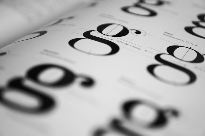
Playing around with different typography can bring another element of appeal to your site. Not only does it contribute to the overall attractiveness, but it also implies a hierarchy within the site. Big and bold fonts display a certain importance whereas more simple tones serve as support to the user interface.
However, much like colours, you must choose fonts wisely to create a simple yet cohesive look. You should also consider the preference of your audience to maximize the positive effects on your users.
Don’t forget menus and navigation bars
In using a minimalist aesthetic, most people completely forgo using menus and navigation bars. However, those elements guide the users in navigating the page, in finding links and other information that they might need.
To minimize the space they take up, you can just incorporate navigation buttons inside the menu and disguise the homepage button in the company logo. Keep in mind that you do not only want a good design, but it should be functional over everything.
Explain with photos
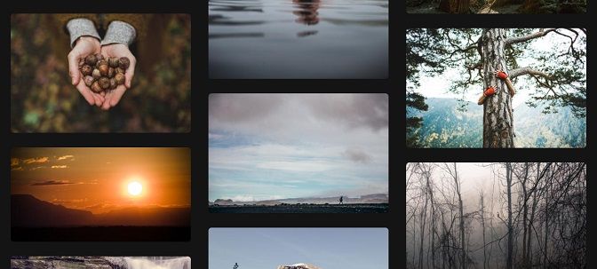
Bold and bright photos enhance the appeal of your site to your customers; it creates an emotional connection between them, which hopefully enchants them to come back. Images shouldn’t only be used for the appeal, though. It should also showcase the products or services you offer.
Make sure that you use HD photos to ensure the visual effect of the photo isn’t compromised and ensure that it ties in with your overall look.
Mix with tiny details
The reason behind the continuous popularity of minimalism is its flexibility. In its simplicity, there is a lot of room to satisfy new needs as time goes by and a lot of room for little design details that can ultimately elevate your whole aesthetic.
Non-function details such as flying decorative signs, underlining, geometric objects and fragments have grown in popularity because they contribute to the uniqueness of the design. It could also balance out the content or even direct attention to it.
You’re free to add as many details as you please but do so that the easy navigation isn’t compromised.
Conclusion
Minimalism remains one of the most popular design aesthetics especially these days in the field of web design. The reason it’s so popular is its ease in adapting to the different preferences of the designer. You could do so much with it and explore so many options that you can ensure your design to be one of its kind.
But no matter how attractive or appealing your website, you must never sacrifice usability over aesthetic. Keep your site efficient and functional to encourage your customers to keep coming back for more.
Author Bio:
A true expert in web design and mobile app development, Kenneth Sytian offers web design services in the Philippines and owner of Sytian Productions. His no-nonsense approach to design and a decade of solid experience is a winning combination for his clients.
