First impressions count, especially online. When someone visits your website, they form an opinion in just a few seconds. If it looks dated, cluttered or hard to use, they’ll likely leave without a second thought. But if your site looks polished and trustworthy, they’re more likely to stay, explore and get in touch.
The good news is you don’t need to be a designer to make your website look more professional. With a few practical changes, you can present your business in a better light and make it easier for people to connect with you.
Whether you’re a small business owner building your first website, or managing a growing site on a limited budget, these tips will help you create a more polished and engaging experience for your visitors.
1. Clean and simple layouts make a big difference
A cluttered layout can be overwhelming and hard to navigate. Clean, well-structured designs help visitors focus on what matters and understand what your business is about. A simple layout also makes your site look more modern and trustworthy.
When designing or updating your site, aim for:
- Plenty of white space to avoid visual overload
- Clear sections that guide the eye naturally
- A consistent layout across all pages
- Avoiding too many competing elements or distractions
Start with a layout that feels balanced. Don’t try to say everything at once. Think about what your visitors are most likely to need, and make those areas easy to find.

2. Colours and fonts: Stick to a simple style
Colour and typography play a big role in how professional your site looks. Too many colours or fancy fonts can make things look messy and unpolished. Simplicity creates clarity.
Here’s how to keep it looking sharp:
- Use two or three main colours throughout the site
- Make sure text contrasts well with the background
- Choose one or two fonts that are easy to read
- Use consistent font sizes and styles across headings and body text
- Avoid decorative or script fonts unless used sparingly
A consistent visual identity gives visitors confidence in your brand, even if they don’t consciously notice why.
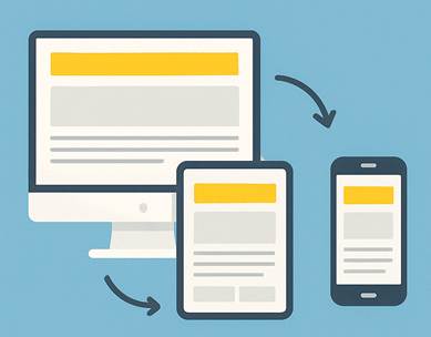
3. Make sure it works on mobile
More than half of web traffic now comes from mobile devices, so your site needs to look good and function properly on smaller screens. If users have to pinch, zoom or scroll sideways, they’re likely to give up quickly.
To make sure your site is mobile friendly:
- Use a responsive layout that adapts to different screen sizes
- Avoid small buttons or tightly spaced links
- Make sure text remains readable without zooming in
- Test your site on several devices (phones and tablets, both Android and iOS)
A mobile-friendly site isn’t just convenient for users, it also helps your visibility in search engines like Google. If your site doesn’t pass basic mobile usability tests, it could be pushed further down the rankings.
4. Use high-quality images (Even free ones)
Images can make or break the look of your website. Low-resolution, generic, or awkwardly cropped pictures make a site feel amateurish. High-quality visuals, on the other hand, help build trust and professionalism.
If you’re not using original photography, you can still find great free options. Sites like Pexels, Unsplash and Pixabay offer professional-quality images for free.
Keep in mind:
- Choose images that fit your brand and feel authentic
- Always check usage rights and give credit if required
- Compress images before uploading to keep your site loading quickly
- Stick to a consistent visual style and colour tone
Also think about where and how images are placed. Avoid using images just to fill space. Every image should add value, whether it supports the text, shows your product or service in action, or builds an emotional connection with your audience.
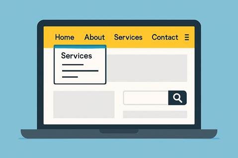
5. Keep navigation simple and familiar
A clear, easy-to-use menu helps people find what they need quickly. Confusing or cluttered navigation is one of the fastest ways to lose visitors.
Good website navigation includes:
- A straightforward menu with 5–7 key pages
- Clear labels like Home, About, Services, Contact
- Logical page order with dropdowns used sparingly
- A contact option that’s easy to spot on every page
Try to think like your user. What would you expect to find first? Which pages are essential? If you have a lot of content, consider adding a search function or filtering options to make things easier.
6. Make your content easy to read
Even the best layout won’t save your site if the content is hard to digest. Long blocks of text are difficult to read, especially on mobile devices. Good formatting helps readers quickly scan and absorb the information.
Some simple rules to follow:
- Use headings and subheadings to break up content
- Stick to short paragraphs (2–4 lines max)
- Use bullet points or numbered lists for clarity
- Choose plain language over jargon wherever possible
- Keep a consistent tone that suits your audience
If writing isn’t your strong point, consider hiring a copywriter or asking someone to proofread your content before publishing.
7. Add trust signals
A professional appearance helps build trust, but adding specific elements to your site can further reassure visitors that you’re credible and reliable.
Consider including:
- Testimonials or reviews from past clients
- Logos of businesses you’ve worked with
- A short About section with your photo or story
- Contact details, including a physical address if relevant
- A secure HTTPS connection and privacy policy
If you collect emails or accept payments on your site, make sure this process feels secure and transparent. The more people trust your site, the more likely they are to take the next step—whether that’s contacting you, booking a service, or making a purchase.
Final touches: Consistency is key
The final layer of professionalism comes from being consistent across your entire website. Disjointed visuals, mismatched fonts or awkward spacing make things feel unfinished.
Before going live, do a final check:
- Are fonts and heading styles consistent?
- Do images align properly and use the same dimensions?
- Are buttons and links styled the same way?
- Have you checked for spelling and grammar mistakes?
It’s these finishing touches that help your website feel cohesive and trustworthy. If you’re ever unsure, ask someone outside your business to take a look and give honest feedback.
Conclusion
Creating a professional-looking website doesn’t require specialist design skills. With a clean layout, simple colour scheme, mobile-friendly design and a focus on clarity, you can make a big impact. Add in high-quality images, clear navigation and a few trust signals, and your site will stand out for all the right reasons.
The aim isn’t perfection. It’s about helping people feel confident in you and your business the moment they arrive.
About the author
Fred Morpeth is a freelance web designer and SEO expert based in Bristol, UK. He runs Vamos Web Design, helping small businesses build websites that not only look great but are easy to use and rank well on Google. With a focus on clean design, WordPress development and on-page SEO, Fred works with clients across the UK and beyond.