The massive challenge ecommerce websites are facing these days is the conversion of visitors into buyers and then loyal customers. When the firms create their websites, customer’s ease and comforts remain their top priorities, which is why the concept of user experience (UX) has been on top of users’ heads when they judge ecommerce websites and decide whether or not to buy from them.
The websites on which UX has not been emphasized during the designing phase have suffered in the last few years. It can hurt your ecommerce business on several levels: Firstly, customers may turn away from your site to the one that is easier and simpler to use. Secondly, it can hamper your search rankings as Google now prioritizes the most authentic and easy to navigate sites.
Do’s of UX design techniques for Ecommerce:
Clear brand positioning
If you want to be an effective ecommerce site, you need to grab the user’s attention by crisp and clear brand positioning, as the estimated time visitors take to form their first impression of your website is just 50 milliseconds.
The display of brand varies from industry to industry.
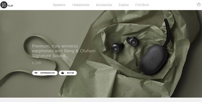
For example, a luxury wearable technology retailer’s website is likely to look different from a budget conscious site for general household items and goods. Bang & Olufsen, for example, convey the message of their brand using elegant fonts, a sophisticated colour, and sleek product images.
CTA (Call to Action)
When a user visits your site, make sure to greet them with timely content and relevant calls to action (CTAs). As customer navigates through your website, it is highly advisable that your CTAs should be easily visible, engaging and specific. It is imperative that you don’t use generic words for CTA.
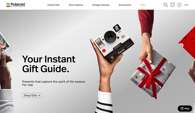
Polaroid was quite successful in creating an effective CTA during the holiday season by helping the users who were shopping for presents. They make sure they don’t use common words, but rather they used a phrase word like Shop Gifts, making it crystal clear that user would be navigated to the area on the website with different suggestions for gift items.
Integrate social media into your UX
While ecommerce user experience is more focused on convenience and motivation, social media centres around influence. If you think about it, you cannot motivate your customer to buy from you until and unless they feel that you are influential, and vice versa. The reality is that they are both different sides of the same coin, which is why integrating social media into your ecommerce design is a great way to enhance user experience.
Sophie and Trey, for example, are one of the US fashion brands that do this well through the Shop the Gram section on their website. The way they make use of user-generated content to encourage visitors to buy helps the customers to understand the way the brand is used, get access to feedback, connect on a more personal level with the brand; hence a win-win scenario is created.
Don’ts of UX design techniques for Ecommerce:
The mistakes committed in the designing phase of the website can really hurt your UX and eventually hamper your company’s profits. These errors in judgment can have a severe impact in the long run for the company. Following are some of the strict don’ts for your ecommerce UX:
Don’t provide ambiguous product descriptions
When people shop online, they are looking for comfort as well as the description of the product or services they are looking for. It increases the frustration levels of customers when they find inadequate information about the product they are looking to buy.
Ideally, your website should provide as much information as possible regarding products they are offering. This clarity of the features facilitates customers in selecting the right product, and it also saves their time. This not only is helpful for the customers but for the business as well, as the chances of after sales complaints go severely down.
Don’t create a difficult checkout process
In the modern world of ecommerce, ease is the name of the game. When customers finally decide to choose your brand and product, you don’t want to make things complex for them in the checking out phase.
Often ecommerce websites will overstuff their descriptions and other content with the keywords they think will help their product page rank well on search engines; practices like these need to be done very smartly, if not done correctly, they can land you in serious google penalties that you should avoid at all costs.
Remember, this is the stage where you wanted the customer to take; to lose a customer from this point is a mere pity. Some online businesses make a horrible mistake of formulating a highly technical and less user-friendly mode of payment. The more steps you put between the item adding to the cart and final checkout, the more opportunity your customer has to abandon the cart and never return to the site.
Don’t make users wait long for content
The online marketing world is quite delicate, and your content marketing strategy should not just centre around quality content but also around the experience it will offer. You don’t want your customers to switch to your competitors upon the occurrence of any mistake at your end. When they visit your site, they want things to move fast and smooth.
A blank screen, shown when the content is loading, can give a bad impression of your site like your site is frozen. This can trigger the annoyance and frustration levels of your valued customers. The ecommerce sites should strive to give the impression that their respective website is swift and responsive.
Summary
The field of ecommerce has come a long way since its inception. Its growth is tremendously fast and depends greatly on UX. It is estimated to grow to more than 4.48 trillion dollars, which is almost more than double the numbers from the previous year of 2017.
If you want to be one of the ecommerce brands that stand out from the rest, avoid the mistakes mentioned above. Not just that, but keep doing your research to make sure you and your website stay updated on the latest ecommerce ux best practices.
Author Bio:
Jenny Harrison is a passionate marketing and business blogger. She loves to engage with readers who are seeking B2B and B2C marketing related information on the internet. She is a featured blogger at various high authority blogs and magazines in which she shared her research and experience with the vast online community. Currently, she is associated with www.PNCDigital.com, an Orlando based Ecommerce Development Company specializes in OpenCart, Magento, Shopify Web Development.


