From 1995 to 2020, E-commerce has definitely come a long way in terms of scale, volume and relevance. Cheap shoes, groceries, or a plane ticket to go see your loved ones. There is no end to what you can buy off the internet, just by spending a few minutes and clicking a few buttons.
An e-commerce site gives you the opportunity to build a brand that customers will love to shop from, time and again. It lets you connect with your customers and grow them while selling your products and services. For an E-commerce website to truly do its job, that is to get your more paying customers; it is important that it has the right website design.
With 2020, being a landmark year for E-commerce websites, it is essential for current and future E-commerce platforms to understand how design can affect sales on their websites.
To help you stay abreast of the latest web design trends for e-commerce websites in 2020, we have put together a few e-commerce website design tips that can help you design an e-commerce store with ease.
Web design trends for 2020:
1. E-commerce sites should be easy to navigate
Talk about getting lost on the way to the check-out cart. Many E-commerce websites are guilty of having way too much content on the site. A cluttered website leads to confusion in the minds of a visitor. Often when unclear, customers abandon the cart and leave for your competitor’s website.

The navigation on an e-commerce website and the path to check out should be extremely clear and should involve as few steps as possible.
2. E-commerce sites should establish a solid brand identity
One thing that can ultimately make or break your E-commerce store is branding. A brand is something people like to be associated with. It differentiates you from your competitors.
When designing a website, you should put equal thought in defining your brand. Infuse your brand into all the elements on your site.
There are thousands of counterfeit E-commerce sites on the internet and brands are the only element that helps to distinguish the credible sites. Branding helps build trust and drives sales on an E-commerce site.
Your site’s content, i.e. the images and text, should establish the brand’s identity. From Logos to web copy, everything on the website should look professional, with no room for errors.
3. E-commerce sites should be designed keeping in mind their visitors
From website design, look and feel to ultimate experience, your E-commerce site should aim to educate the customer and make a sale.
When designing websites for E-commerce platforms, it is important to make pages and elements that mirror the visitors buying journey. Make the whole process of shopping quick and hassle-free. Customers love to visit a site repeatedly if the checkout process is easy.
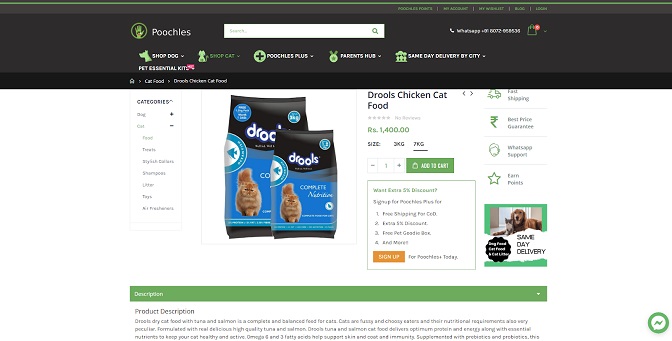
Think of it this way. You are a web surfer looking to buy cat food online. What do you first type in? The necessary keywords, right?

What else do you look for?
- A good picture of the product
- Its detailed description
- Additional information
- Check out and payment modes
- Confirmation of your order
Having proper product pages is also one of the critical factors to make an e-commerce website work.
4. An E-commerce site should include colours that relate to its products/services
Buyer psychology says that customers, when making a buying decision, are influenced by the colours that they see. Be it in physical stores or on E-commerce platforms; colours play an important role. Positive affirmative colours that signify trust should be used on E-commerce websites in order to drive more sales.
As a general foot rule, most E-commerce websites lean towards the colour white, to highlight the products rather than the website. The colour blue is generally used on service-based websites to build trust. Food and other grocery websites, make use of the colour red, which signifies hunger.
Always differentiate the decider buttons, or the Call-to-action buttons, by having them in a different colour. For conversions (sales) to happen, these buttons must stand out from the rest of the web page elements.
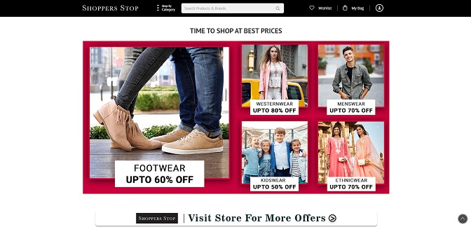
5. E-commerce sites should have crisp content and High-Quality images
Images have a direct effect on sales. On E-commerce platforms, people cannot get the touch and feel of the product. The decision of whether to buy the product or not lies solely on its images/ video.

Not just the product images- headers, banners, footers and randomly scattered advertisements, should have high-quality imagery to convey credibility. When listing your products for sale, put up professional images, clicked from multiple angles, to help users decide easily.
Also, you can even make your social content shoppable by tagging products into your visual content using the visual commerce platform and embedding these shoppable galleries on your eCommerce website that will also increase your sales directly.
Apart from images, the web copy and other content on the site needs to be stellar as well. Most text content is generally not given a read, but there are certain keywords and modifiers that won’t go unnoticed.
Customers on an e-commerce site come for the images and not to read long copy. Therefore, the text should be able to convey the brand message in as few words as possible.
Also, don’t forget to use testimonials, they come in very handy, to increase both trust and conversions. Aim for having more 4 and 5-star ratings & reviews.
6. E-commerce sites should use responsive website design to render across all platforms
A Mobile and smartphone obsessed generation needs shopping websites, that function equally well on their cell phones just as they do on PCs.
Proper rendering on mobile devices, with quick responsive design and functional buttons, is key to making your e-commerce site work.
According to Bigcommerce, Mobile visitors account for 54% of total E-commerce sales. Responsive design is of paramount importance if you wish to do more business.
7. E-commerce sites should have a clear site architecture with categorization
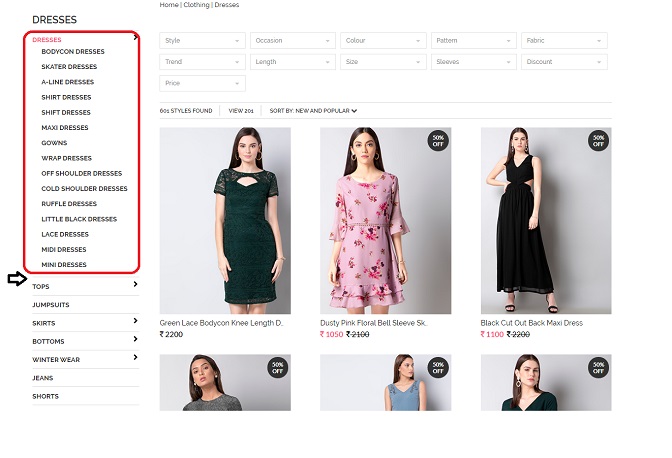
An E-commerce website can have anywhere from 1-1000 products or more listed on it for sale. What is important on a big website, is proper product categorization.

By using appropriate filters, or categorising products in a pre-defined Menu, users find it easier to get to the product they came looking for, ultimately ending in a sale.
If product categories are not made, items are all scattered around, making it difficult for the customer to find his way to his desired product. It is just like a department store, as long as it’s neatly organised, the cash registers keep ringing.
8. E-commerce sites should be secure
When shopping online, customers trust only credible sites that are safe to make transactions. Having an SSL encrypted site with secure payment gateways is key to having an effective E-commerce web design.
Final thoughts:
Website design is easy, but when it comes to E-commerce portals, it is a challenge to make sites that can actually convert. With the above-mentioned E-Commerce website design tips and some help from a reputed design and development agency, designing an e-commerce website becomes simpler.
Author Bio:
Shaista Mujeeb is a copywriter at Wolftain, an advertising agency in India. Having expertise in digital marketing and social media management, she is at par with writing both technical and non-technical content. She is also a foodie with an avid interest in the art of Makeup and Cosmetology.


