When we are asked to choose a healthcare brand of preference, we often end up choosing something that embodies trust, tranquillity, and faith. After all, our lives depend on it. When it comes to branding, healthcare logo design is one aspect that most organizations have spared a thought at length before.
Despite multiple talks of improvisation, it appears not much has changed from yesteryears; especially when it comes to the kind of colours organizations are using in their logos. Yes, it’s blue that still seems to rule the roost.
So the question that obviously begs an answer is:
What is it with Blue??
Over the years and even today, healthcare companies are known to be rather conservative and rigid with their branding approach. It is this attitude that keeps them from experimenting. Blue was established as the go-to logo colour for healthcare quite some time back. The primary reasons being a group of feelings that are generally associated with the colour, such as – calmness, reliability, security, trust, amidst others.
Blue generally comes across as a peaceful and serene colour that drives instant comfort on the beholder’s eyes. The primary objective of healthcare companies has always been to promote their brand as one that is reliable and secure. The colour blue has worked wonders in all these years and continues to do so.
However, as more and more healthcare companies continue to adopt this colour, there is bound to be a few companies that will want to stand out from the crowd. Whether or not they have what it takes to try out other colours for their logos remains to be seen. But, one can’t help but feel that they have to in order to stand out.
The most popular colours
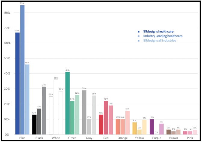
Blue obviously peaks the tree, but there are a few other colours that brands have tried experimenting with – green and white being the significant others. As per findings by 99designs, 85% of healthcare logos have the colour blue in them, followed by green (41%), and white (36%).
Companies have ideally resisted from colours like brown, grey, and orange as generally, people associate a certain level of dirt and uncleanliness to them. The following graph provides a clear indication of the colours that healthcare companies use.

(Source)
Understanding Brand Personality is the key to experimentation
With such a huge percentage of companies resorting to blue, companies are left with no choice than to break away from the usual blue-mantra to differentiate themselves from the mass. But, before going ahead with a particular colour, understanding what the brand stands for is very important.
Colours exude certain personality traits. For instance – the colour red stands for something loud and bold, blue for peace and tranquillity, pink for hope and feminism. Now the question is how to determine the kind of personality that the brand exudes?
Well, the easiest way to figure out is by finding answers to these questions. Is the brand youthful or caters more to the mature mass? Is it more masculine or feminine? Is it a brand that is for the luxurious mass or one that is affordable? Is it serious and subdued or playful and loud?
Once the answers to these questions are on the table, the brand personality can be effectively determined. Thereafter, steps can be taken to zero in on the colour of the new company logo.
Top Healthcare Companies looking to break the streak
As mentioned earlier, amidst all the healthcare companies resorting to the colour blue for their logos, there are a few top companies looking to break away from the trend. For instance – CVS Health Corporation, one of the most renowned retail pharmacists based out of the US, dons a logo that is red and black in colour. Many would think that it’s not the wisest choice. The common association one has of red is promotional, especially with so many retail brands around with red-coloured logos.
But in reality, the colour has more to it. When it comes to healthcare, red actually can be really meaningful. For starters, red is the colour of blood, which is immediately synonymous to the industry. Besides, red invokes a feeling of boldness and support. So in hindsight, brands who have shelved the idea of using red earlier might just have missed a trick. Not CVS though.

The black used by CVS in tandem with red just adds to the boldness of the logo, as black generally denotes toughness and dynamism. Besides, it also separates CVS from the common “blue” mass. Apart from red and black, other colours that companies might contemplate to use are yellow and pink. Yellow invokes a sense of warmth, joy and optimism, while pink invokes a sense of nurture and feminism.
So, companies that are targeting kids or infants can look to use yellow and other warm colours like orange in their logos. On the other hand, those targeting females can use pink. For instance – a healthcare organization catering to women suffering from breast cancer can think of using pink in their logos. Again, it all depends on what the brand personality is.
These are colours that healthcare companies usually use while looking to break away from the usual blues and greens. A colour that is almost completely ignored is brown and understandably so as it just simply does not come across as a colour that is sterile and neat. Hence, experimenting with this might not be the greatest of ideas. However, there are companies that use colours that completely put them above and beyond everyone else.
Take the colour purple for instance. Not many would look to incorporate it in their logos. Many would think that that it is too flamboyant a colour for healthcare. In actuality, that’s not really true. The colour purple evokes a lot of emotions like nobility, royalty, power, luxury, etc. No wonder one of the top healthcare insurance companies in the world, Aetna went ahead with the colour.

(Source)
Purple is also considered to be the combination of the stability of blue and the boldness and energy of red, which in true sense can be the best thing for a healthcare logo.
It’s all about being different
In today’s day and age where competition is soaring high, brands should look to adopt means that will help their customers differentiate them from the mass. The first and probably the most important thing to any branding endeavour is a compilation of the brand logo, and it’s more than just a random collation of colours and images. If one has to stick out from the crowd, having the same colour combination in the logo as most of the other competitors will not really help. And this especially holds true for new companies trying to enter the market.
What’s required is for brands to understand the kind of message that they want to portray, and of course the brand personality as mentioned above. The trick also lies in understanding colour psychology and the various associations that different colours exude.
Most healthcare companies today choose to be main-stream in their colour choice to be on the safer side. But the real trick to strong, long-term brand establishment lies in doing something different. Before looking too far forward and thinking about a brand mascot or investing in other technologies, companies should focus on creating a proper logo first.
Authors Bio:
Aditya is the founder of Digital Polo a unique design company that provides unlimited design work for a simple, affordable fee. Branding is simple if you know your way around the design bit of it. Through Digital Polo, Aditya has provided ample reasons to brands across the globe to buy into this claim.


