Back in the early days of ecommerce, giving a customer an endless array of choices might have been a good thing. But today, surprisingly enough, too many choices are leading to a phenomenon called choice overload. When presented with too many options to choose from, buyers cannot decide which product to buy. They feel overwhelmed and end up abandoning the purchase.
They think they’ll come back to it when they’ve made up their mind, but as a seller, you can’t always be sure they’ll come back to you. You need to cinch the deal right when you have the customer’s attention. This requires that you help your customers navigate through the sea of options and find their perfect product faster.
To truly succeed, online stores need to give customers efficient ways to communicate with your website or app and tell it exactly what they want to buy. Now, almost every site out there has some sort of ‘sort and filter’ system that allows customers to narrow down their search criteria, but you’d be surprised how many of this fall short of really helping the customers.
The Baymard Institute, an independent web and mobile usability research institute performed extensive usability tests on 19 leading ecommerce websites across the world. Findings indicated that 84% of the sites had mediocre to poor filtering experience. Moreover, they also found that on such sites, abandonment rates went as high as 67 to 90%.
Using filters and sorting effectively can mitigate this problem and help users find just the right product they need. Facets are a newer, more sophisticated way of filtering products and providing users a great shopping experience. Facets take into account not only the attributes of a product but also the way a customer would use the product and extract value from it.
Here’s a look at some of the best practices to use a combination of filters and facets to help enhance your UX and help customers shop and convert, without feeling overwhelmed.
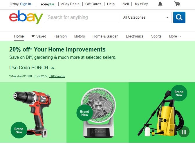
1. Provide important filters above the fold
Image source: ebay
No, it’s not a myth. The fact that content above the fold still holds the major part of a viewer’s attention is the truth and isn’t likely to change anytime soon.
E-commerce app pages are full of the information above the fold. There are featured products, advertisements, promotional content and so much more. Your user is already beginning feel a little overwhelmed. Filters could give them some much-needed relief right now, but if you pushed them under the fold, they are easy to miss. To prevent your users from overlooking the filter option and scrolling forever, make your important filters prominent and clearly visible above the fold.
In fact, not all customers think of filters themselves. They just like to jump right into the products list, which can often end up in endless scrolling and eventual abandoning. Avoid this by making your filters prominent, graphics and attention-grabbing right at the top, so that customers notice them and start telling you more about what they want, giving you an opportunity to serve them better an ensure a better experience.
2. Provide option to eliminate
Sometimes, it’s easier to say ‘show me all the colours except red’ than to say ‘show me blue, pink, green, white, beige, black and maroon’.
This happens a lot when something too popular seems to be all over the search results. Say, for instance, you are looking for an apartment in a very specific part of the city. The biggest housing project in that area is also the most popular one. So more than half of the apartments you see in the search results come from this project. But you’ve already ruled this out and want to see all the other options but this one.
It would be downright impossible to select all the other builders, independent resale homes and new developments in this area. What would be easier then? To just exclude this one project and allow all others to show up in search results.
Design filters to not just include specified attributes but also exclude a few.
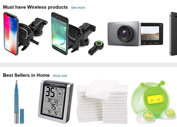
3. Provide thematic filters
Image source: Amazon
So while you try to make it easier for the customers to find what they want, there’s another aspect at play here. You can’t just leave the customer alone to decide what they want to buy today. They might not always know.
Customers like to explore and find new products but in a certain circle of preference. Essentially this means that they’d like you to show them products they don’t already know about, but include products of a particular kind, and leave out the rest. This can be done using thematic filters like ‘top selling this week’, ‘value for money’, ‘holiday special’ or ‘season specials’. Such filters allow customers to see what’s new and popular, within their choice perimeters. It’s akin to having a special shopping experience designed just for them, and who doesn’t like that?
4. Allow multiple filter values
You’d be surprised how often this happens. You want to see TVs from at least 4 top brands but leave out the others. So you try to click those 4 brand names in the filters list, but the moment you click the first name, the page begins to refresh and shows you all TVs from that one brand. Now you click the second one and the page refreshes again. You have to do this 4 times if you wish to see all the results you want. In fact, in a worse scenario, you may not even be allowed to select multiple values and the first one might uncheck when you check the second one.
This can be an absolute hassle for the customer who wants a combined view of all his preferred brands in one screen. So be sure to allow multiple filter values in the category. Allow them to check as many as they like and only then refresh at the end.
5. Display applied filters and allow easy changing
Don’t just let the filters disappear once the customer begins viewing the results. Keep a list (collapsible if you wish) within easy reach so that customers can change their selections anytime they like. Also, display clearly the filters you have applied to the current page. Don’t make the customers work hard to remember what they chose. Allowing an easy reset button would win you extra points in the user experience department.
Conclusion
With the number of ecommerce businesses out there today, the customers are really being spoilt for choice and businesses need to work that much harder to make a sale. Discounts and sales will only get you so far. What you really need is to become that one site that makes the customers’ life easy.
They wouldn’t be easily distracted by a competitor offering a discount, if they are sure that you will help them find their perfect product faster, offer a smooth shopping experience and save them precious time and their sanity. That is just what you can do if you can offer a perfectly streamlined filtering experience, giving the customers only what they want and giving it to them faster.
Author Bio:
Hiral Atha is the Founder and CEO of MoveoApps, a mobile apps development agency. She has over 13 Years of experience in the IT industry. During that time she managed and lead many app initiatives from inception to implementation. Atha holds a bachelor’s degree in information technology.


