Designing web pages is all about putting together a balanced and appealing composition that will attract readers. And one of the most important aspects of Typography is making sure your text looks good and is easy to read.
In this article, we’ve put together ten tips on web design Typography that will help you improve the look and readability of your text. So whether you’re a beginner or an experienced web designer, make sure to read on for some helpful advice!
What is typography in web design?
Typography in web design refers to the use of typefaces, font sizes, line spacing, and other elements of typesetting to create a visually appealing and easily readable website. It plays a crucial role in the overall design and user experience of a website, as it can affect readability, legibility, and overall aesthetic.
Good typography can make a website more visually appealing and easy to navigate, while poor typography can make a website difficult to read and less engaging. It is important to choose appropriate typefaces, font sizes, and line spacing that complement the overall design of the website and make the content easy to read.
Importance of typography in web design
Typography is an important aspect of web design for several reasons:
Readability: Good typography makes the text on a website easy to read and understand, which improves the user experience and helps to keep visitors engaged.
Aesthetics: Typography can be used to create a certain visual style or aesthetic on a website. It can be used to convey a certain tone or personality and can help to make a website more visually appealing.
Branding: Typography can be used to reinforce a brand’s identity and create a consistent visual style across all of a company’s marketing materials, including its website.
Accessibility: Poor typography can make a website difficult to read, particularly for people with visual impairments or reading difficulties. Good typography, on the other hand, can help to make a website more accessible to all users.
SEO: Proper typography, including headings, subheadings, and paragraphs, can help to structure the content in a way that makes it more easily understood by search engines, which can improve the website’s search engine ranking.
Overall, typography plays a critical role in creating a visually appealing and user-friendly website and is an essential element of good web design.
Here are the ten tips on typography in web design
- Use a clear, easy-to-read font: Choose a font that is legible and easy on the eyes, such as Arial, Georgia, or Open Sans.
- Be consistent: Use the same font throughout your website to create a cohesive look and feel.
- Set the right size: The text on your website should be large enough to be read easily but not so large that it takes up too much space. A font size of 16 pixels is a good starting point.
- Use headings and subheadings: Organize your content into headings and subheadings to make it easy to scan and read.
- Use whitespace: Don’t clutter your pages with too much text or too many elements. Use whitespace to separate different sections of your website and make it easy to read.
- Use colours effectively: Use colours to create contrast and make your text stand out. But also use colours in moderation.
- Keep it aligned: Left-align your text for the body copy, but consider using the centre or right alignment for headings and subheadings.
- Use line spacing: Increase the line spacing (also known as “leading”) to make your text more legible.
- Avoid underlining text: Underlining text can make it difficult to distinguish between links and regular text.
- Test your design: Test your design on different devices and browsers to make sure it looks good and is easy to read on all of them.
Typography mistakes in web design
Typography mistakes in web design can include using too many different fonts, not using a hierarchy of font sizes and styles to guide the user’s eye, not providing enough contrast between text and background colours, and not using web-safe fonts.
Other mistakes can include using small text that is difficult to read, not properly spacing out text, and not using proper line height and letter spacing. It’s important to test the website on different devices and browsers to ensure consistency and accessibility.
Typography trends in 2023
It’s difficult to predict with certainty what the typography trends will be for 2023, as design trends are constantly evolving. However, based on current trends, it’s likely that we will see the following in web design typography:
Bold and oversized type: Large, bold typography will continue to be popular as it helps to create a strong visual impact and can be used to draw attention to important information.
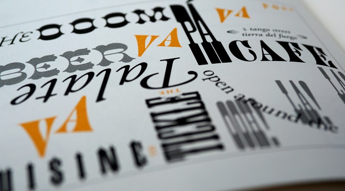
Hand-drawn and brush lettering: Hand-drawn and brush lettering will continue to be popular as they add a personal and unique touch to a design.
Mixing typefaces: Mixing different typefaces in a single design will become more common, as it creates a layered and dynamic look, but it’s important to use it carefully and make sure it’s readable.
Asymmetry: Asymmetrical layouts and unexpected typography placement will be popular as they create a sense of movement and visual interest.
Accessibility and legibility: With the growing awareness of web accessibility, typography that is legible and easy to read will become more important. Typography that is designed to be easy to read on all devices and screen sizes will be a key trend.
It’s worth noting that these are just predictions, and trends tend to evolve over time, but keeping an eye on these trends can help you to create a modern and visually appealing website.
Conclusion
Typography in web design is one of the significant aspects and can make or break your content. As such, we have already discussed all the important factors that matter in this article, but there is an additional aspect that can really prove to be handy if you keep it in mind.
The right use of fonts not only elevates the quality but also enhances user experience. So, do not skip on font choices while designing your website’s layout because they can help boost conversions and add more engagement to your content!


